UI/UX Design
Shreddy
AI-Powered Fitness & Workout App Redesign
Year :
2026
Industry :
Health & Fitness
Client :
Shreddy
Project Duration :
6 weeks
Overview
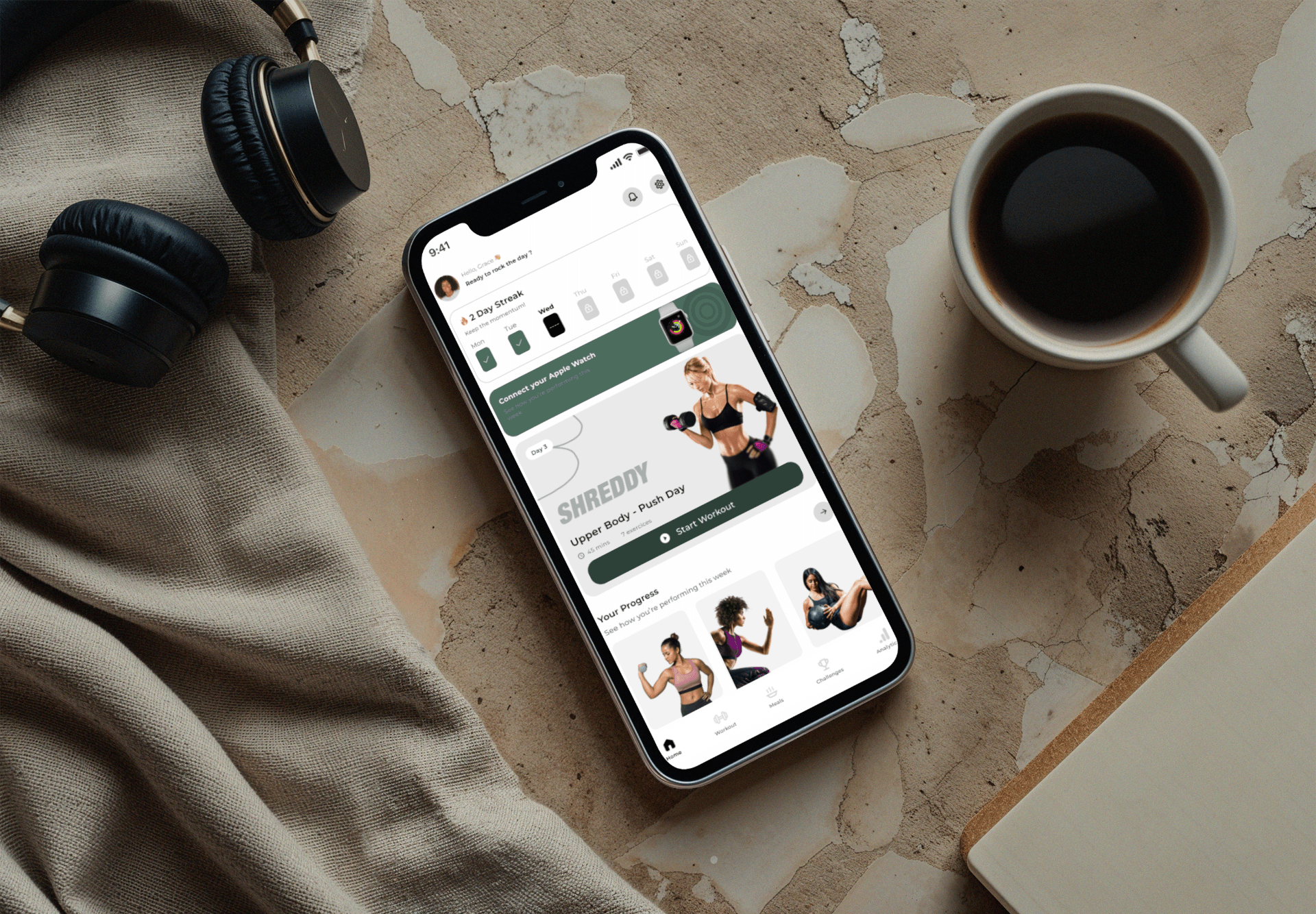
Shreddy is an AI-powered fitness app that generates adaptive workout plans. I redesigned the mobile experience end-to-end — onboarding, plan generation, in-workout guidance, and progress tracking — turning a feature-heavy app into a focused daily training companion.
Role
UI/UX Product Designer — mobile redesign, design system, and interaction design.
The problem
The Challenge
The original app buried its strongest feature — AI-generated adaptive plans — behind dense menus and generic dashboards. New users abandoned during setup, and returning users struggled to find the single thing they came for: today’s workout.
Long, form-heavy onboarding before any value
Today’s workout was three taps deep
Progress data shown without meaning or context
Inconsistent components across screens
Low weekly retention after the first session
The approach
The Solution
I restructured the app around a single daily focus: one clear session, generated and adapted automatically. Everything else supports that moment rather than competing with it.
Value-First Onboarding
A short, conversational setup producing a real plan within the first minute, deferring optional profile details until after the first workout.
Single-Focus Home
A home screen built around today’s session with clear duration, intensity, and equipment, so starting a workout is always one tap away.
In-Workout Clarity
A large-type, glanceable workout mode with set tracking, rest timers, and simple substitutions for missing equipment.
Meaningful Progress
Progress views explaining what changed and why the plan adapted, replacing raw charts with plain-language insight.
Mobile Design System
A consistent component library with tokens for typography, spacing, and states, ensuring every screen feels part of one product.
The outcome
Impact & Results
The redesign shortened time-to-first-workout dramatically and made the AI adaptation visible rather than invisible. Testing showed faster task completion, clearer comprehension of plan changes, and stronger intent to return the next day.
Key Learnings
Deliver value before asking for data.
One clear daily action beats a feature-rich dashboard.
Adaptation only builds trust when it is explained.
Consistency is what makes a fitness app feel dependable.
More Projects




UI/UX Design
Shreddy
AI-Powered Fitness & Workout App Redesign
Year :
2026
Industry :
Health & Fitness
Client :
Shreddy
Project Duration :
6 weeks
Overview
Shreddy is an AI-powered fitness app that generates adaptive workout plans. I redesigned the mobile experience end-to-end — onboarding, plan generation, in-workout guidance, and progress tracking — turning a feature-heavy app into a focused daily training companion.
Role
UI/UX Product Designer — mobile redesign, design system, and interaction design.
The problem
The Challenge
The original app buried its strongest feature — AI-generated adaptive plans — behind dense menus and generic dashboards. New users abandoned during setup, and returning users struggled to find the single thing they came for: today’s workout.
Long, form-heavy onboarding before any value
Today’s workout was three taps deep
Progress data shown without meaning or context
Inconsistent components across screens
Low weekly retention after the first session
The approach
The Solution
I restructured the app around a single daily focus: one clear session, generated and adapted automatically. Everything else supports that moment rather than competing with it.
Value-First Onboarding
A short, conversational setup producing a real plan within the first minute, deferring optional profile details until after the first workout.
Single-Focus Home
A home screen built around today’s session with clear duration, intensity, and equipment, so starting a workout is always one tap away.
In-Workout Clarity
A large-type, glanceable workout mode with set tracking, rest timers, and simple substitutions for missing equipment.
Meaningful Progress
Progress views explaining what changed and why the plan adapted, replacing raw charts with plain-language insight.
Mobile Design System
A consistent component library with tokens for typography, spacing, and states, ensuring every screen feels part of one product.
The outcome
Impact & Results
The redesign shortened time-to-first-workout dramatically and made the AI adaptation visible rather than invisible. Testing showed faster task completion, clearer comprehension of plan changes, and stronger intent to return the next day.
Key Learnings
Deliver value before asking for data.
One clear daily action beats a feature-rich dashboard.
Adaptation only builds trust when it is explained.
Consistency is what makes a fitness app feel dependable.
More Projects
UI/UX Design
Shreddy
AI-Powered Fitness & Workout App Redesign
Year :
2026
Industry :
Health & Fitness
Client :
Shreddy
Project Duration :
6 weeks
Overview
Shreddy is an AI-powered fitness app that generates adaptive workout plans. I redesigned the mobile experience end-to-end — onboarding, plan generation, in-workout guidance, and progress tracking — turning a feature-heavy app into a focused daily training companion.
Role
UI/UX Product Designer — mobile redesign, design system, and interaction design.
The problem
The Challenge
The original app buried its strongest feature — AI-generated adaptive plans — behind dense menus and generic dashboards. New users abandoned during setup, and returning users struggled to find the single thing they came for: today’s workout.
Long, form-heavy onboarding before any value
Today’s workout was three taps deep
Progress data shown without meaning or context
Inconsistent components across screens
Low weekly retention after the first session
The approach
The Solution
I restructured the app around a single daily focus: one clear session, generated and adapted automatically. Everything else supports that moment rather than competing with it.
Value-First Onboarding
A short, conversational setup producing a real plan within the first minute, deferring optional profile details until after the first workout.
Single-Focus Home
A home screen built around today’s session with clear duration, intensity, and equipment, so starting a workout is always one tap away.
In-Workout Clarity
A large-type, glanceable workout mode with set tracking, rest timers, and simple substitutions for missing equipment.
Meaningful Progress
Progress views explaining what changed and why the plan adapted, replacing raw charts with plain-language insight.
Mobile Design System
A consistent component library with tokens for typography, spacing, and states, ensuring every screen feels part of one product.
The outcome
Impact & Results
The redesign shortened time-to-first-workout dramatically and made the AI adaptation visible rather than invisible. Testing showed faster task completion, clearer comprehension of plan changes, and stronger intent to return the next day.
Key Learnings
Deliver value before asking for data.
One clear daily action beats a feature-rich dashboard.
Adaptation only builds trust when it is explained.
Consistency is what makes a fitness app feel dependable.